
Sunday, 30 January 2011
Fact.
I heard something quite interesting today about Alphred Hitchcock and his films: He always appeared in them. Never as a main character, but often as an extra. So now, every time i watch one of his films i am going to have to see if i can find him. But as he is soo famous - would he have worn a disguise? If he did it is going to be extra hard to find him!

Thursday, 27 January 2011
Experimenting with unnatural light.
This didn't really apply to my outdoors following scene as i couldn't control the streetlights but when i film my poker scene i have to place different lights in different ways to create different moods. To help me with this, i got my female actress to sit in one place (which is what she does during the poker scene) and i move the light around her to see what effects i can create. As i was limited to the amount of light i could actually use as there were only a few spotlights available, i tried the best i can to create various shadows on her face. These photos are SHOCKINGLY bad at showing my 'photography skills' but these pictures only show how unnatural light can shine on somebody's face. Also, i need to note that my OTS will be in black and white, and these photos are in colour! So here they are and i have also added a few explanations about the good and the bad of each photo:

Ignoring the blur on this photo, i like that the unnatural light has highlighted her face and left the background completely black. The light was shined straight to her face by slightly angled down. This has made her cheekbone more defined - which adds to the seduction and glamour.

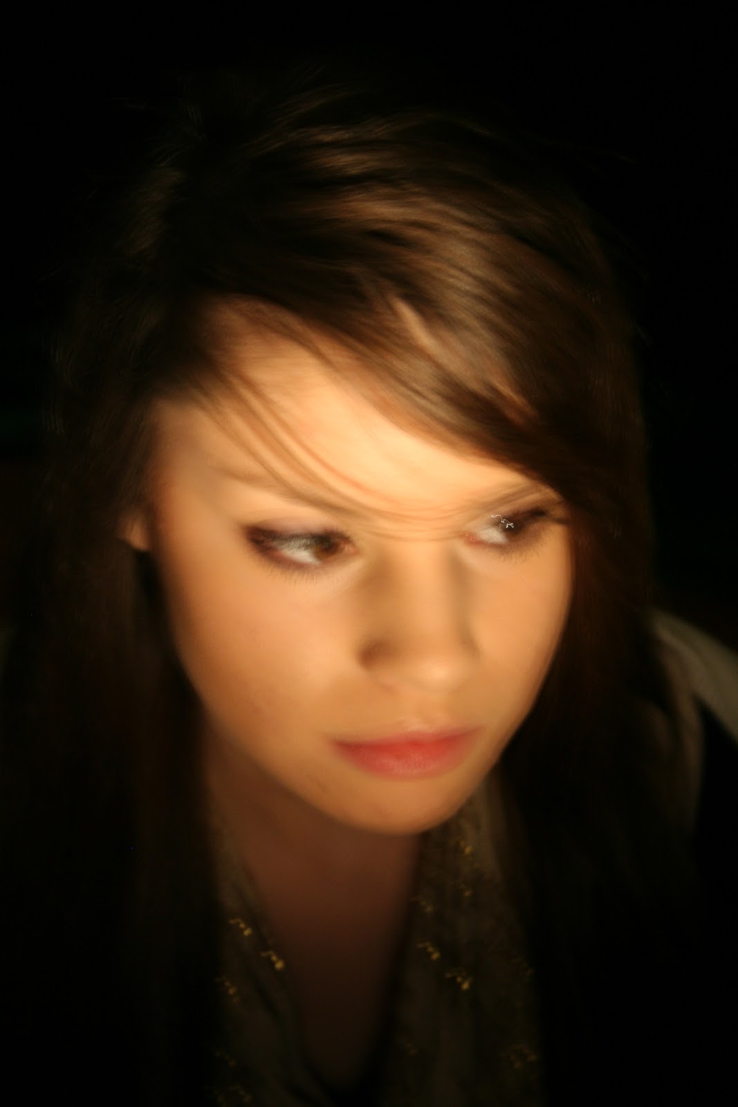

I think if the light was making her cheekbone stand out, it would have made the light more appealing. But as it is just straight onto her face which is flat. However, i do like that the camera is pointing up, so you can see the outline of her jaw bone.
I really like this photo, not only because of the dark background but the angle she has her face in and the height of the camera can show that she is mysterious, reserved and delicate.
I'm not too keen on this picture as it looks as if she doesn't actually have any long hair which is sweeped beside her face. You cant see the expression in her eyes (because you cant see her eyes!) and no cheekbone is defined. But i do like that her face is in focus and her shoulders aren't.
 Not a very flattering light exposure onto her face, but i like that there are interesting shadows the light has created. If there was light coming from behind her, that was shining along her cheek, I'm sure it would have been more appealing.
This reminds me of a film noir shot as she is looking down and the camera is then looking down on her. You can see her eyes, cheekbone and the background is black. I also like that the light shining off of her necklaces is visible - possibly showing her wealth and sophistication. Probably the best shot so far.

I love a profile shot, and she has a lovely profile so I'm sure that when i film my OTS, i could replicate this photo in a screen shot.The lighting is very soft and light, but unfortunately it is coming from underneath her chin, making her nostrils attention-seek with the light shining on them!

In this photo i was trying to capture her hair, but still create a black background.I do quite like this angle as her eyes are dark and her profile is lovely. I love the small amount of light shining on her face - very subtle and delicate.
 I wanted to have half of her face in the dark and half of it in the light which could represent the two sides of a character. Even though i accomplished this, the light side is maybe too light. I like that she is looking to the light sight - possible representing something!
  Not the lost brilliant photograph. The light should never be pointed at her crown in the case of a film noir and you cannot see her face as much as you should. Your attention goes straight to her head!
Just like the previous one, her face isn't in the light - which should be! You cannot see her expression and our attention goes straight to her head. Her eyes and chin are in the dark but her nose is in the light. Not what i was aiming for particularly!
 I love this profile and look-up shot! However, the light has kind of ruined this as it is strong on her head but, i like the shine of light on her cheekbone!
AGAIN, the light is shined straight at her head, but as the shine is nearly out of the shot, it doesn't matter as much. Its a shame that there is no diversity of shadow-shades on her face - the light is flat. I like the position of the camera looking down on her.
 In stead of a dark background, this is a light background which i kind of like - however I'm not sure what it will be like when the screen is in black and white. Her face is is full light (shame) but i like the small amount of light on her nose.
I really like the angle of the camera in this one, she looks very sweet and mysterious - we wonder what she is looking at. I tried to capture her eyelashes against the light background because i think that could show femininity. I'm not impressed by the straight light on her chin, it looks a bit strange! I like that she is in the bottom right half of the frame but i would have liked it EVENMORE if the background was black.

If only the background was black! But this photo has captured her eyelashes and i like the half in the light, half not in the light thing. If this photo was taken from slightly higher, i think it would have created more of an effect.


This picture is a bit too close-up and i think that the shadow could been a little darker. Too much of the background is in the light so we are distracted.

If this was taken a little bit lower it would be better, because at the minute, she looks as if she would be very short! Her eye that is in the shadow is undefined.
 I like this photo because: there is a black background, her cheekbone is defined, it is a slight profile shot, and her jawbone has a shadow also. To improve this picture, her fringe could have been on the other side - creating mystery and to give the sense that she has a secret.
 The classic torch-under-the-face-Halloween-shot! I was trying to experiment with different shadows i could create but the light is strong under her shin and has made under her eyes look more enhanced and bigger than what they actually were.
Not the most flattering shadows and the light is wayy to strong on her neck as you. Her nose also has a strange shadow in it - making us focus straight away on that.

When taking these photos, i tried to play with interesting and different angles which could be possible when filming with a film camera. I have to take into consideration whenever looking at these photos that i am filming completely in black and white which could affect the tone of shadows and light. However the similarity with black and white shots and colours shots is that - the brighter the light, the brighter it will turn out on camera and the darker the shadow, the darker the shadow on the camera. I'm glad i had a little practise with the way light can effect mood and impressions of people which I'm sure will come in useful. I need the audience to guess right about a character because there is not a lot of dialogue. The audience needs to guess what a character is like and have their own opinions on them without the characters actually speaking.
First editing session and problems with separate clips.
Today, i thought it was about time to start editing even though i have only filmed half of my OTS. I think editing this half will give me more time to edit the soon-to-be-filmed other half and gives me a chance to experiment with Imovie. I may also play with a computer file called 'final-cut' which lets you cut certain objects out of shots. It can also help you to add more effects that iMovie offers. I may use 'Final-cut' to cut some posters out of a shot i have. This shot is of the telephone box on it own, and to the left of the telephone box is scraps of ripped off posters which I'm not too sure this really fits the 1950s feel!
I played all of my clips and was quite glad that i had all of the right shots i needed, but concerned about continuity and have the angles i had planned to have in my finished OTS. So far, i have only edited up to the part where my male character in the telephone box and the mysterious lady walking past (excluding credits etc) but i did have a problem.
This problem is that i had a shot of the telephone box with lasted about 7 seconds with no male character walking into it. According to my storyboard there had to be a short while (around 7 seconds) of just a shot of the box and then my male character walking into the box, look around and then pick up the telephone.However, for some reason, i didn't film the male character walking into the telephone box after waiting for 7 seconds - i just stopped the clip. The next clip was of the telephone box again, but this time after around 2 seconds my male character actually did walk into the telephone box. I couldn't fit these clips exactly together because you would be able to tell that they were different clips. Also, i wasn't in the EXACT right place when filming both of these shots.
To fix this problem, i added in a transition effect between both of the shots - this transition faded out of the first shot, then faded into the next. Having this transition meant it didn't matter as much that i wasn't in the same position and also the fading in-out effect gave the effect of time passing by. Sorted.
I have been trying to stick EXACTLY to my storyboard, which i shouldn't be doing, as these ideas might not actually work with the footage. I'm never going to dramatic changes, but i might have to adds things in to make it flow a bit better, but the whole chronological order will be very similar to my storyboard. Any changes that i do make, i will identify and explain with posting.

Tuesday, 25 January 2011
Targets for the next three weeks.
- PHOTOSHOP POSSIBLE TEXT ONTO MY BACKGROUND PICTURE TO TEST WHAT IT WOULD LOOK LIKE.
- SEND OUT A FACEBOOK POLL!!!
- Make sure that all videos needed on blog are actually on it, with me evaluating and commenting. Including the continuety storyboard and my concept board presentation.
- Make sure i have filmed and edited my OTS in time for the DEADline and while i was filming the poker scene, i took photos of me testing the layout and lighting.
- Make sure all of the boxes are ticked on the to-do list in booklet.
- Finalise sound
- dont more posts on sound and lighting
- Take photos of me experiementing with light on my actresses face
- plan the FINAL text which will go ontop of my city scene - organise the font and colour etc.
Setting targets: are they...?
specific
measurable
achievable
realistic
time related
A winning deck.
A very helpful person educated me the other day on what is the best deck of cards to win. With this persons help, i now know that a 10, Jack, Queen, King and Ace are the cards i need. Apparently it is very rare that these combination of cards can come up, but as my male character is cheating, i thought i can get away with it. I have also been thinking about whether or not i should have all of the cards the same 'shape' (i don't know what the word is!) but i mean are they all going to be spades, hearts, diamonds etc.
After some thinking i figured it would be the best idea to have them all of the same 'shape' just to make sure that the continuity is the same in every shot. It would be a disaster if i was editing and found out that the fan of cards the male character is holding were in the same order all the way through the poker game. I also think it would be a good idea to have the 'shape' either a spade or club as these 'sjhapes' are black. If they were red i think they wouldn't stand out so much and not give as much impact as a black 'shape'. So here are the cards i am planning to use:

Remember: I must not forget to film a shot of the gun coming out of my killers coat pocket and also a shot of the trigger being pulled. I didn't film these when i was on location when we were filming the scene of my male character being followed as i thought it would be very risky to wave a gun about in public. So to be on the safe side i decided i would film these two shots (which are close ups) possibly against a brick wall and edit the shot so that it is darker than it originally was. I will then slot inbetween the shots of my killer pointing the gun up the steps at my victim and when she is following him.
After some thinking i figured it would be the best idea to have them all of the same 'shape' just to make sure that the continuity is the same in every shot. It would be a disaster if i was editing and found out that the fan of cards the male character is holding were in the same order all the way through the poker game. I also think it would be a good idea to have the 'shape' either a spade or club as these 'sjhapes' are black. If they were red i think they wouldn't stand out so much and not give as much impact as a black 'shape'. So here are the cards i am planning to use:
Remember: I must not forget to film a shot of the gun coming out of my killers coat pocket and also a shot of the trigger being pulled. I didn't film these when i was on location when we were filming the scene of my male character being followed as i thought it would be very risky to wave a gun about in public. So to be on the safe side i decided i would film these two shots (which are close ups) possibly against a brick wall and edit the shot so that it is darker than it originally was. I will then slot inbetween the shots of my killer pointing the gun up the steps at my victim and when she is following him.
Monday, 24 January 2011
Analysing the film noir 'Notorious' (1946).
I decided it would be a good idea to watch an OTS of a very popular film noir and then see if i can get any inspiration from it.
Just from the from cover of the DVD you can tell that this film is about a man and a women and the relationship or situation between them. The woman (Ingrid Bergman) is obviously very beautiful which could persuade and influence the male audience to want to go and see her, and the man (Cary Grant) is very handsome, so it could make the female audience want to go and see him. Linking this back to my OTS, as this is not going to be made into a DVD, the audience will not know what my characters will look like before they see it. However when they actually start to watch the poker game commence, they will see that my female character is very attractive (her attractiveness will be enhanced by black clothing, dark eye make-up and her mystery), she is also young-looking which will appeal to my male audience (age range: 16-25). My OTS will appeal to the female audience by them hopefully being drawn in by the costumes and creative use of lighting and suspense.
I do understand that my male character (my dad.) might not appeal to 16-25 year old females, but to make the audience believe that he is old enough to have all of this money, he can look slightly older than my female characters.
Going back to the film noir 'Notorious', the DVD cover that i have is less suggestive of romance than the other covers i have seen. The other covers show more interaction between the main male and female characters, but my cover is of the man on the phone, and the woman's profile shot on the other half of the cover. I did notice that she isn't on the phone also, so there is no interaction between him and her. They aren't on the phone to each other!
Here is the DVD cover i have:
 As you can see, the light is shining on her, and he is more in the dark - maybe to suggest he is the sneaky baddie? Even though they both look very good looking, its just a bit plain and could have been more thought out so it would fit more with the film plot.
 Here, only Ingrid Bergman is on the cover looking very concerned yet beautiful. The background is all black so we are focusing on just her face - it can persuade the male audience to want to pick the DVD up. From just looking at this DVD cover i wouldn't have guessed that there is a main male character in it. However, she does look very alone and venerable - which is what she may feel in the film.

I like this cover because straight away it tells us there is a romance between the two lead roles. She is frightened and venerable, and he is comforting her. There is a photo of her in the blue background with a man who i don't know if it is Cary Grant or another male character in it - Claude Rains.
I'm guessing that there have been different covers because of different companies releasing it, but all films have been certified a 'U'. I was also thinking that if i have time after completing my editing etc, i could make my own DVD cover?
After analysing the DVD cover, i started to watch the OTS of 'Notorious'. I made notes as i went along, noting all about what was going on, camera shots, and what different things could suggest. I haven't noted what time i saw scenes, but the whole OTS lasted for around 2 minutes 20 seconds. Here are the lit of notes i made:
- There is a really quick shot of a white, happy and very American looking house. 'Pathetic Fallacy' - The happy scene has set the scene to a happy life of somebody living there? We feel a cheerful atmosphere.
- We are then taken onto the credits where the back ground is of a city - just like my own idea. However, this city background looks as if it has been painted, but mine will be a edited photograph. I used a city scene to set-the-scene which might be what Alphred Hitchcock (Director) intended. I also was thinking that as we were shown a house and then a city scene, it could suggest that the scene we are about to be shown is out of the city - going further and further away from the happy house.
- The credits are around 1 minute 10 seconds - showing us the cast and crew (the usual, typical credits). And then the credits say:
"Miami, Florida, Three-Twenty P.M,
April the Twenty-Fourth,
Nineteen Hundred and Fourty-Six"
It took me a few minutes to understand what they meant but i worked it out and found out in 'normal terms' what it means. Here is what it would have looked like if they put it in everyday vocabulary:
"Miami, Florida, 3:20pm,
April 24th, 1946"
I think they may have written it like this because it would be seen as more formal and could suggest 'police speak' - so we may get the hint that we will see some police or people who enforce the law.
- There is then a lovely shot of an old fashioned photo camera with a big flash on it, the shot the zooms out to show a man was holding the camera. The shot then moves even further out and to the side to uncover yet more men with cameras. It gave the hint that they could be journalists.
- We then are shown 180 degrees around the room stopping on a man who is slightly opening a very tall pair of wooden doors. As he is only opening the door a fraction of a degree, we get the impression that he knows he shouldn't be looking. But the 'peeking Tom' doing this is crucial for us to know that this case in court could be serious. There is then an upward movement of the camera to a sign above the door. This sign says:
"United States District Court"
- So now we know that the photographers are waiting to take photos of somebody coming out of the court, and the 'peeking Tom' was sneaking a look into a court room. This is a close up shot.
- We see a point of view shot of the 'peeking Tom' as he opens the door a bit more to show the people inside. I think the only reason this door was opening a bit more was because the film camera wouldn't have been able to fit over the 'peeking Tom's' shoulder and see enough of the room.
- While still seeing inside the court room, but seeing just the back of them. We see and hear the judge charge a unidentified defendant guilty of treason, and forced to be imprisoned for 20 years. The judge hits the gavel (i had to wikipedia that).
- The 'peeking Tom' says to the journalists: "here she comes". Everyone who was in the court room comes out of the door and the photographers start snapping Ingrid Bergman's character. We assume she could be related to the defendant in some way because she is looking miserable and there must be a reason for her to be snapped by journalists.
- Then a journalist comes up to her and asks her for a statement about her father - suggesting that she might have been witness to the incident? Our predictions were right about her being related to the defendant.
- Another man (possibly a policeman) talks to the 'peeking Tom' telling him to let him know if Ingrid Bergman's character tries to leave home.
- We then get the same still house shot we did at the start of the OTS. WE guess this could be Ingrid Bergman's characters home because the 'peeking Tom' was just mentioned to about her leaving home.
Throughout the OTS there is mainly medium and close up shots.
Treason - A crime that is serious betrayal of one's sovereign or nation.
In conclusion
I have really enjoyed watching this OTS so far, and i think analysing it like i did has encouraged me to watch the rest of it. This is probably because i heard EVERYTHING everybody had to say, and had to pay attention to everything. I love the soft black and white effect here (i know it was made in 1946 so these people didn't know anything different, but to watch it now when we have more diverse technology, its much appreciated) and it definitely makes you appreciate the amount of time that goes into old films compared to now due to technology development. Whenever i have tried to watch an old film, i normally cant keep up, or its too slow and i know i have missed key dialogue to understand what is going on. It does make me wonder why if i get lost when watching an old film and why i don't normally get lost when watching a new film? I have come to the conclusion that this might be because this film is very subtle (it is a film noir after all!) and i don't think it was the way in 1946 to make films that were in your face. Whereas now, i think films are made which are quite forward and obvious, with sarcasm and high volumes!
I decided to make my point clear about how different films were back before the 50's to how they are now, i am going to make a table. I have chose the changing point to be in the 50's because that was when colour television was big in the U.S. And also the 50's and mainly the 60's were when culture started to change - linking back to audience theory booklet. Here is the table i made:

Just from the from cover of the DVD you can tell that this film is about a man and a women and the relationship or situation between them. The woman (Ingrid Bergman) is obviously very beautiful which could persuade and influence the male audience to want to go and see her, and the man (Cary Grant) is very handsome, so it could make the female audience want to go and see him. Linking this back to my OTS, as this is not going to be made into a DVD, the audience will not know what my characters will look like before they see it. However when they actually start to watch the poker game commence, they will see that my female character is very attractive (her attractiveness will be enhanced by black clothing, dark eye make-up and her mystery), she is also young-looking which will appeal to my male audience (age range: 16-25). My OTS will appeal to the female audience by them hopefully being drawn in by the costumes and creative use of lighting and suspense.
I do understand that my male character (my dad.) might not appeal to 16-25 year old females, but to make the audience believe that he is old enough to have all of this money, he can look slightly older than my female characters.
Going back to the film noir 'Notorious', the DVD cover that i have is less suggestive of romance than the other covers i have seen. The other covers show more interaction between the main male and female characters, but my cover is of the man on the phone, and the woman's profile shot on the other half of the cover. I did notice that she isn't on the phone also, so there is no interaction between him and her. They aren't on the phone to each other!
Here is the DVD cover i have:
 As you can see, the light is shining on her, and he is more in the dark - maybe to suggest he is the sneaky baddie? Even though they both look very good looking, its just a bit plain and could have been more thought out so it would fit more with the film plot.
Here are the other DVD covers i have found:
 Here, only Ingrid Bergman is on the cover looking very concerned yet beautiful. The background is all black so we are focusing on just her face - it can persuade the male audience to want to pick the DVD up. From just looking at this DVD cover i wouldn't have guessed that there is a main male character in it. However, she does look very alone and venerable - which is what she may feel in the film.
This shot of the woman is from the film and she looks seductive and mysterious. Cary Grant is looking very dapper in his suit and bow tie - again persuading the female audience to want to buy it. She is looking over her shoulder at him - maybe suggesting that she doesn't want to get close but still always has her eye on him? And that the scene where this photo is taken doesn't have Cary Grant character in it - he is superimposed onto it. I must also note that she is below him on the cover - suggest male dominance?

I'm guessing that there have been different covers because of different companies releasing it, but all films have been certified a 'U'. I was also thinking that if i have time after completing my editing etc, i could make my own DVD cover?
After analysing the DVD cover, i started to watch the OTS of 'Notorious'. I made notes as i went along, noting all about what was going on, camera shots, and what different things could suggest. I haven't noted what time i saw scenes, but the whole OTS lasted for around 2 minutes 20 seconds. Here are the lit of notes i made:
- There is a really quick shot of a white, happy and very American looking house. 'Pathetic Fallacy' - The happy scene has set the scene to a happy life of somebody living there? We feel a cheerful atmosphere.
- We are then taken onto the credits where the back ground is of a city - just like my own idea. However, this city background looks as if it has been painted, but mine will be a edited photograph. I used a city scene to set-the-scene which might be what Alphred Hitchcock (Director) intended. I also was thinking that as we were shown a house and then a city scene, it could suggest that the scene we are about to be shown is out of the city - going further and further away from the happy house.
- The credits are around 1 minute 10 seconds - showing us the cast and crew (the usual, typical credits). And then the credits say:
"Miami, Florida, Three-Twenty P.M,
April the Twenty-Fourth,
Nineteen Hundred and Fourty-Six"
It took me a few minutes to understand what they meant but i worked it out and found out in 'normal terms' what it means. Here is what it would have looked like if they put it in everyday vocabulary:
"Miami, Florida, 3:20pm,
April 24th, 1946"
I think they may have written it like this because it would be seen as more formal and could suggest 'police speak' - so we may get the hint that we will see some police or people who enforce the law.
- There is then a lovely shot of an old fashioned photo camera with a big flash on it, the shot the zooms out to show a man was holding the camera. The shot then moves even further out and to the side to uncover yet more men with cameras. It gave the hint that they could be journalists.
- We then are shown 180 degrees around the room stopping on a man who is slightly opening a very tall pair of wooden doors. As he is only opening the door a fraction of a degree, we get the impression that he knows he shouldn't be looking. But the 'peeking Tom' doing this is crucial for us to know that this case in court could be serious. There is then an upward movement of the camera to a sign above the door. This sign says:
"United States District Court"
- So now we know that the photographers are waiting to take photos of somebody coming out of the court, and the 'peeking Tom' was sneaking a look into a court room. This is a close up shot.
- We see a point of view shot of the 'peeking Tom' as he opens the door a bit more to show the people inside. I think the only reason this door was opening a bit more was because the film camera wouldn't have been able to fit over the 'peeking Tom's' shoulder and see enough of the room.
- While still seeing inside the court room, but seeing just the back of them. We see and hear the judge charge a unidentified defendant guilty of treason, and forced to be imprisoned for 20 years. The judge hits the gavel (i had to wikipedia that).
- The 'peeking Tom' says to the journalists: "here she comes". Everyone who was in the court room comes out of the door and the photographers start snapping Ingrid Bergman's character. We assume she could be related to the defendant in some way because she is looking miserable and there must be a reason for her to be snapped by journalists.
- Then a journalist comes up to her and asks her for a statement about her father - suggesting that she might have been witness to the incident? Our predictions were right about her being related to the defendant.
- Another man (possibly a policeman) talks to the 'peeking Tom' telling him to let him know if Ingrid Bergman's character tries to leave home.
- We then get the same still house shot we did at the start of the OTS. WE guess this could be Ingrid Bergman's characters home because the 'peeking Tom' was just mentioned to about her leaving home.
Throughout the OTS there is mainly medium and close up shots.
Treason - A crime that is serious betrayal of one's sovereign or nation.
In conclusion
I have really enjoyed watching this OTS so far, and i think analysing it like i did has encouraged me to watch the rest of it. This is probably because i heard EVERYTHING everybody had to say, and had to pay attention to everything. I love the soft black and white effect here (i know it was made in 1946 so these people didn't know anything different, but to watch it now when we have more diverse technology, its much appreciated) and it definitely makes you appreciate the amount of time that goes into old films compared to now due to technology development. Whenever i have tried to watch an old film, i normally cant keep up, or its too slow and i know i have missed key dialogue to understand what is going on. It does make me wonder why if i get lost when watching an old film and why i don't normally get lost when watching a new film? I have come to the conclusion that this might be because this film is very subtle (it is a film noir after all!) and i don't think it was the way in 1946 to make films that were in your face. Whereas now, i think films are made which are quite forward and obvious, with sarcasm and high volumes!
I decided to make my point clear about how different films were back before the 50's to how they are now, i am going to make a table. I have chose the changing point to be in the 50's because that was when colour television was big in the U.S. And also the 50's and mainly the 60's were when culture started to change - linking back to audience theory booklet. Here is the table i made:

There are soo many things that i have missed out on this table which i will definitely put on as soon as i can. I have noticed that the way people live, the thoughts a beliefs they have do effect the way film is made. I think film-makers try and push boundaries but they knew they shouldn't push them too hard. You have to know your limit.
Thursday, 20 January 2011
This is me doing work.

Unfortunately it wasn't successful compressing it as i kept create multiple copies of the same video file. I am going to get help very soon with this and my videos will be up and running!
Tuesday, 18 January 2011
My targets for this week.
- Put storyboard video on vimeo and then onto blog.
- Evaluate continuety task.
- Put concept board filmed presentation onto vimeo and then onto blog (may have to edit the film!)

- Evaluate continuety task.
- Put concept board filmed presentation onto vimeo and then onto blog (may have to edit the film!)

Update: 18-2-2011
- My storyboard video, has taken ages to compress in the past, therefore, forcing me to shut it down before it has completed. As our deadline is around the 28th of Feburary, the videos need to be unloaded soon. I have talked to people to help me, and they are in the process of compressing and uploading the videos for me. I also need to upload the videoed storyboard for our continuety task.
- Evaluating continuety task - I am planning to do these sort fo post during the half term as i like to take time and get the posts as detailed and as right as possible. They take a lot of time. During the half term, i am planning to re-check ALL of my post and complete them.
- My concept board presentation is on vimeo right now, so i am going to embed it and upload that to my blog asap.
Film Noir video OTS
I found this video on vimeo.com while just typing in 'film noir' it cant be uploaded so you can watch it on my blog. So i here is the hyperlink: I am only analysing the OTS of it even though the whole video lasts about 9 minutes.
Film Noir from Brenton Thom on Vimeo.
When i started to watch it, i noticed the props were very similar to mine - cards, cigarettes, telephone etc. The first shot is of a moving shot to the left moving along the surface of the table. This table has cards, a lot of cigarettes, and the phone - but suddenly - a hand pops up and rests on the table edge. We then find out that this hand belongs to a man who then gets up and sits on the chair while wiping his eyes. He looks bruised (i don't know if this is the lighting!) and starts lighting up one of the many cigarettes. We get the impression something has happened to cause him to be bruised and on the floor. He doesn't look like a very happy man. And by the hat, tie and shirt he is wearing, we could assume that he is a businessman and somebody you should not mess with. I also noticed that when he wakes up and just after he rubs his eyes, he puts the phone back on the stand - as if he was on the phone last night before he was hurt. He wasn't awake to then put the phone back on the stand. Still slumping in his office chair, he takes out the cigarette without actually lighting it. There are then a second of darkness - telling us that this is the end of the scene.
In this OTS, we never actually find out what is wrong with him and why he is bruised and looking distressed. If it because he has had an argument with somebody? Was it a woman or a man who hurt him? Why would somebody some to his office and hurt him? No questions were answered in this first OTS - making you want to watch the rest of the film to find out.
What is right with this OTS?
- The contrast between black and white is effective and believable.
- The logo of the fake film company starts in colour for a few seconds and then moves to black and white - there is a company logo.
- The first couple of credits are nice.
- The mise-en-scene is effective and believable.
What is wrong with this OTS?
- The logo of the fake film company starts in colour for a few seconds and then moves to black and white - the logo should be always black and white and era-correct.
- The shot along the table is too fast and you do not have time to see in detail what is laying on the table. The fast motion of the camera creates a fast and lively feeling. If the motion was slow, then maybe it would create the feeling of tiredness, mystery and a relaxed atmosphere. Film noir is meant to be quite slow.
- The shot along the table is also not smooth - it jumps a few times.
- A unexpected and too strong of a cut between a close-up of him putting a cigarette in his mouth and then moving to a far-away shot of him sitting there. To much of a difference between the shots.
How similar is it to my future OTS?
- Not all questions are answered in my OTS
- No dialogue or dramatic sound
- Black and white with era clothing
- A still shot when text is on top of it. In my OTS i am having a city scene with my credits over the top. In this OTS there was a short still shot of a telephone off its base with production text on it. There is no cast credits however in the credits (unlike mine).
Safe and sound.
I have decided that to save time, i will record sound from another film noir (I can do this because they are over 50 years old, and the music will probably be classical anyway) using the film camera. Having to download and apply the sound to my OTS will be very time consuming and i think that recording it will give a distorted effect.
I am going to watch the famous film noirs 'Notorious' and 'Spellbound' (both directed by Alphred Hitchcock) to see if there is any of the correct sound i will be looking for.
I am looking for the right sound which i cannot define in words, but it has to fit in with the poker scene. It will be very quiet so i cant be too picky. For the following scene, i would like really deep and tensed music, to create mystery and suspense. im sure i will find what type of music i am looking for because the theme and look of my OTS is quite conventional.
Thursday, 13 January 2011
Social classification and specification/marking criteria systems.
Commonly used social classification systems
National Readership Survey (JICNAR)
| Classification | Description |
|---|---|
| A | Upper middle class |
| B | Middle class |
| C1 | Lower middle class |
| C2 | Skilled working class |
| D | Working class |
| E | Subsistence |
Registrar General's Social Classes
| Classification | Description |
|---|---|
| I | Professionals |
| II | Managerial & technical |
| IIIN | Skilled non-manual |
| IIIM | Skilled manual |
| IV | Partly skilled |
| V | Unskilled |
NS-SEC 2001
| Classification | Description |
|---|---|
| 1 | Managerial & professional |
| 2 | Intermediate occupations |
| 3 | Small employers & own account workers |
| 4 | Lower supervisory & technical |
| 5 | Semi-routine & routine Never worked & long-term unemployed |
My audience using this classification system would probably be lower middle class because of the wealth of my characters. I also think they are skilled non-manual people who are small employers. I find this very stereotypical and as my target audience are male and females aged 16-25, im sure that not all of them are employers themselves, so i had to cut it down to what their parents did and how they were brought up as they are still at a young age.
Here is the assemesment criteria:
Assessment of final video
Level 3 36–47 marks
There is evidence of proficiency in the creative use of many of the following technical skills:
holding a shot steady, where appropriate;
framing a shot, including and excluding elements as appropriate;
using a variety of shot distances as appropriate;
shooting material appropriate to the task set;
selecting mise-en-scène including colour, figure, lighting, objects and setting;
editing so that meaning is apparent to the viewer;
using varied shot transitions and other effects selectively and appropriately for the task set;
using sound with images and editing appropriately for the task set;
• using titles appropriately.
Level 4 48–60 marks
There is evidence of excellence in the creative use of most of the following technical skills:
holding a shot steady, where appropriate;
framing a shot, including and excluding elements as appropriate;
using a variety of shot distances as appropriate;
shooting material appropriate to the task set;
selecting mise-en-scène including colour, figure, lighting, objects and setting;
editing so that meaning is apparent to the viewer;
using varied shot transitions and other effects selectively and appropriately for the task set;
using sound with images and editing appropriately for the task set;
using titles appropriately.
Assessment criteria for research and planning
Level 3 12–15 marks
There is proficient research into similar products and a potential target audience.
There is proficient organisation of actors, locations, costumes or props.
There is proficient work on shotlists, layouts, drafting, scripting or storyboarding.
There is a good level of care in the presentation of the research and planning
Time management is good.
Level 4 16–20 marks
There is excellent research into similar products and a potential target audience.
> i have deconstructed films and opening title sequences and looked at the genre of film noir.
> deconstructions of representations of character
There is excellent organisation of actors, locations, costumes or props.
There is excellent work on shotlists, layouts, drafting, scripting or storyboarding.
There is an excellent level of care in the presentation of the research and planning
Time management is excellent.
assessment criteria for evaluation
Level 4 16–20 marks
evaluation questions
- In what ways does your media product use, develop or challenge forms and conventions of real media products?
- How does your media product represent particular social groups?
- What kind of media institution might distribute your media product and why?
- Who would be the audience for your media product?
- How did you attract/address your audience?
- What have you learnt about technologies from the process of constructing this product?
- Looking back at your preliminary task, what do you feel you have learnt in the progression from it to the full product?
Excellent ability to refer to the choices made and outcomes.
Excellent understanding of their development from preliminary to full task.
Excellent ability to communicate.
Excellent skill in the use of digital technology or ICT in the evaluation
HOW TO DO THIS:
WILL BE DONE AFTER I HAVE COMPLETED MY VIDEO AND BLOG.
IN THE ASSESSMENT OF FINAL VIDEO AND FOR THE ASSESSMENT CRITERIA FOR REASEARCH AND PLANNING, LIST UNDERNEATH EACH POINT ABOUT WHAT I HAVE COMPLETED. FOR EXAMPLE:
- HOLDING A STEADY SHOT WHEN APPROPRIATE
- MY OTS (there would be a hyperlink and i could give other examples of my filming to show that i can hold a stready shot)
ALSO, CHANGE THE COLOUR OF FONT TO GREEN TO SHOW THAT I HAVE DONE IT.
WHEN DOING EVALUTATION QUESTIONS, WHICH WILL BE AFTER I HAVE FINISHED ALL OF MY OTS, I CAN FILM ME ANSWERING EACH QUESTION TO THEN PUT ONTO A PREZI. I WILL USE PREZI BECAUSE A LOT VIDEOS CAN BE APPLIED. ONE VIDEO FOR EACH QUESTION. ASK ABOUT THE POINTS UNDERNEATH THE QUESTIONS.
1950's currency.
I am using bank notes and coins in my poker game instead of chips (the reason why is in a few previous posts). As my film noir OTS is set in the 1950's, the money has to obviously be from that era also. I found a really helpful website: http://www.thebanknotestore.com/ which has given me pictures of what the bank notes looked like:

 This 1 shilling note was used during 1950 to 1955. I have purposely chosen the same sort of years to when the 10 shilling note was used.
I have also found some pictures of the shillings that were used during the 1950's. I have to make sure i get the right colour and size to make it look legitimate.
 This coin would have probably been the same size as a 50p is now. The colour is dark with a hint of grey and green.
But my question is would wealthy people in the 1950's really be using shillings to play poker?
To find a conclusion to this problem (whether or not to have coins on my table) i am planning to set up the poker game and take a few pictures to test the lighting, layout and presentation. I will take these pictures before i film the poker game scene, so that on the night of filming, i don't waste time trying to figure what looks right or not. Time is precious!
I also did some research to find out the average earning of a skilled and unskilled worker. As my male character is a businessman, he has to have well over the average amount of money on the poker table. I was internet-looking when i came across this site explaining what the average wage was in the early 1950's:
http://privatewww.essex.ac.uk/~alan/family/N-Money.html
I am aiming mainly for the early 1950s of my film noir due to the costumes, and this site has helped me to see how much much i should have on the table during my poker game.
Linking back to my target audience
As my target audience is ranged from 16-25 year olds, they will not remember or know much about money from the 1950's. I think if my target audience was older, i would have to worry a bit more about if they will notice any errors i may cause when using this money. I do have to still make the money look realistic as 16-25 are probably quite sharp at identifying money!

This specific 10 shilling note was used from 1951 to 1955. There was a note which was used in 1950 but because i don't know the exact year i am setting my OTS, i decided it would be a safe option to use this one. As my characters are wealthy, they are more likely to play poker with 10 shillings notes than they are 1 shilling note.

I have also found some pictures of the shillings that were used during the 1950's. I have to make sure i get the right colour and size to make it look legitimate.
But my question is would wealthy people in the 1950's really be using shillings to play poker?
I don't really think so, as these characters are clearly wealthy and quite 'snobbish'. Also, a lot of money has to be won - enough money for somebody to want to cheat to win it. On the other hand, presentation-wise, having coins on the table would be more interesting and diverse. It could make it look as if there is more money on the table that there actually is. i must have a big think about this fast because i am planning to film the other half of my OTS soon.
To find a conclusion to this problem (whether or not to have coins on my table) i am planning to set up the poker game and take a few pictures to test the lighting, layout and presentation. I will take these pictures before i film the poker game scene, so that on the night of filming, i don't waste time trying to figure what looks right or not. Time is precious!
I also did some research to find out the average earning of a skilled and unskilled worker. As my male character is a businessman, he has to have well over the average amount of money on the poker table. I was internet-looking when i came across this site explaining what the average wage was in the early 1950's:
http://privatewww.essex.ac.uk/~alan/family/N-Money.html
I am aiming mainly for the early 1950s of my film noir due to the costumes, and this site has helped me to see how much much i should have on the table during my poker game.
Linking back to my target audience
As my target audience is ranged from 16-25 year olds, they will not remember or know much about money from the 1950's. I think if my target audience was older, i would have to worry a bit more about if they will notice any errors i may cause when using this money. I do have to still make the money look realistic as 16-25 are probably quite sharp at identifying money!
Poker Table.
I have been thinking about the layout and presentation of the poker game i am yet to film. I do want it to look like a traditional poker table with the curved edges and green felt. Instead of using chips to be he currency of the game (they would be hard to find), i have decided to use money because i think it would look as if the game i more final - as if the players arent going to see each other after this game - its riskier. Somebody is going to win the money and run - or in this case, cheat the money for somebody else.
I have done a bit of research into some inspiration for my poker table, taking into consideration the amount of people in my game and also the size of my living room! Here are a few examples:
 This still image from the film 'Casino Royale', has the right idea of what i want to do, but i would prefer it if my table was smaller, and the rest of the room isn't so bright. This light makes the room look big and i want the opposite. I want to make my room look small, so to do this i am having low, soft lighting. I have to have a light coming from the ceiling so the money can actually be seen - as if the money is under the spotlight creating attention to it.
 I don't think this still image is from any particular film but i like that there is a smokey and tense atmosphere. the tense feeling could partly be the effect of the woman character sitting there, looking very uncomfortable and nervous - she is sitting up straight.The alcohol is on full show (on purpose) showing that this is a sociable game. The television in the background indicates that this is a living room. The fact that this is in a living room has created a tight and claustrophobic feeling - to small to breath. The spotlight shining in the centre of the table has shown us what the main focus is and making our eyes look there. I have also noted the women's early 50's style hair!
From some research i done about whether 16-25 year olds play poker showed me that getting every detail correct on the poker table for my OTS wouldn't have to be absolutely perfect. Most 16-25 year olds don't really like to play poker so if i have the layout of the cards slightly wrong i don't think it will catch their eye. However, i do have to make sure i get the card layout as right as possible because if it is completely wrong then it will be noticeable.
I have done a bit of research into some inspiration for my poker table, taking into consideration the amount of people in my game and also the size of my living room! Here are a few examples:

 I don't think this still image is from any particular film but i like that there is a smokey and tense atmosphere. the tense feeling could partly be the effect of the woman character sitting there, looking very uncomfortable and nervous - she is sitting up straight.The alcohol is on full show (on purpose) showing that this is a sociable game. The television in the background indicates that this is a living room. The fact that this is in a living room has created a tight and claustrophobic feeling - to small to breath. The spotlight shining in the centre of the table has shown us what the main focus is and making our eyes look there. I have also noted the women's early 50's style hair!
Linking back to target audience
From some research i done about whether 16-25 year olds play poker showed me that getting every detail correct on the poker table for my OTS wouldn't have to be absolutely perfect. Most 16-25 year olds don't really like to play poker so if i have the layout of the cards slightly wrong i don't think it will catch their eye. However, i do have to make sure i get the card layout as right as possible because if it is completely wrong then it will be noticeable.
The back-drop of my credits.
I got another chance to take some more photos to be the back-drop of my credits. This time when i went, there was less fog, so the city was more visible. I think on photoshop i will make the photo darker, giving the impression that the poker game is at night. Here is the photo and here is the darker version that i am definitely using as the back drop for my credits to then go onto:

I really like that there is a bit of fog but you can still see the buildings - without giving away that the picture is taken in modern times, not in the 1950's. When the picture is darker, I'm sure it will be more atmospheric and mysterious - setting the scene.
 Here is the darker 'photoshopped' version. You can tell it is a city, and still creating atmosphere and mystery... setting the scene. When taking this photo, i tried to have a good amount of sky so that when i apply my text, the letter would stand-out and be easier to see. I had to also apply my own street lights, making the photo more realistic.
I will add the text when i am editing on a Mac so i can add effects that i choose, while still achieving the atmospheric and eery look. I could also apply sound so it will enhance the movement of the text.

I really like that there is a bit of fog but you can still see the buildings - without giving away that the picture is taken in modern times, not in the 1950's. When the picture is darker, I'm sure it will be more atmospheric and mysterious - setting the scene.

I will add the text when i am editing on a Mac so i can add effects that i choose, while still achieving the atmospheric and eery look. I could also apply sound so it will enhance the movement of the text.
Wednesday, 12 January 2011
What is so special about Danny Boyle?
He is probably one of the most well-known directors of this generation, creating such films as 'Slumdog Millionaire' and the anticipated and a film based on a true story - '127 hours', it would be a major under-statement to say he has won his many awards because of luck. He is undeniably a very talented and interesting director - shelling out numerous AMAZING films.
 The first film he directed was 'Shallow Grave' in 1995, giving the reason for him winning around 8 awards. He was on the road to great success and he definitely lived up to his expectations. He then went on to direct the novel-based film 'Trainspotting'. Britain was raving about this films and hyping up his future projects. Probably due to the era i came from and the age i was when these films were released has meant i haven't had the opportunity to watch these films. However i do notice from the plots and from the occasional quirky humorous line i have heard that he has a trend. This trend would be to create films which are dark and gripping, but collaborating this with dry humour and a few body parts being removed in a variety of ways (note: '127 Hours' and 'Slumdog Millionaire').
 The first film he directed was 'Shallow Grave' in 1995, giving the reason for him winning around 8 awards. He was on the road to great success and he definitely lived up to his expectations. He then went on to direct the novel-based film 'Trainspotting'. Britain was raving about this films and hyping up his future projects. Probably due to the era i came from and the age i was when these films were released has meant i haven't had the opportunity to watch these films. However i do notice from the plots and from the occasional quirky humorous line i have heard that he has a trend. This trend would be to create films which are dark and gripping, but collaborating this with dry humour and a few body parts being removed in a variety of ways (note: '127 Hours' and 'Slumdog Millionaire').
As i was watching him 'working his stuff' on the red carpet of his new film '127 Hours' i wondered what makes his films so hooking. There must be a lot of pressure on him to pump out brilliant films when there is so much expectation and hype to do so. Or if its not pressure that is pushing him to make award-winning films, maybe its just raw-talent.
So in conclusion, what is so special about Danny Boyle?
- He is effortless.
- He does the right amount of humour, the right amount of adventure, the right amount of suspense. There is no specific genre he sticks to.
- He isn't safe with what he does. He pushes the boundaries, but not too far.
Subscribe to:
Posts (Atom)