This didn't really apply to my outdoors following scene as i couldn't control the streetlights but when i film my poker scene i have to place different lights in different ways to create different moods. To help me with this, i got my female actress to sit in one place (which is what she does during the poker scene) and i move the light around her to see what effects i can create. As i was limited to the amount of light i could actually use as there were only a few spotlights available, i tried the best i can to create various shadows on her face. These photos are SHOCKINGLY bad at showing my 'photography skills' but these pictures only show how unnatural light can shine on somebody's face. Also, i need to note that my OTS will be in black and white, and these photos are in colour! So here they are and i have also added a few explanations about the good and the bad of each photo:

Ignoring the blur on this photo, i like that the unnatural light has highlighted her face and left the background completely black. The light was shined straight to her face by slightly angled down. This has made her cheekbone more defined - which adds to the seduction and glamour.


I think if the light was making her cheekbone stand out, it would have made the light more appealing. But as it is just straight onto her face which is flat. However, i do like that the camera is pointing up, so you can see the outline of her jaw bone.
I really like this photo, not only because of the dark background but the angle she has her face in and the height of the camera can show that she is mysterious, reserved and delicate.
I'm not too keen on this picture as it looks as if she doesn't actually have any long hair which is sweeped beside her face. You cant see the expression in her eyes (because you cant see her eyes!) and no cheekbone is defined. But i do like that her face is in focus and her shoulders aren't.
 Not a very flattering light exposure onto her face, but i like that there are interesting shadows the light has created. If there was light coming from behind her, that was shining along her cheek, I'm sure it would have been more appealing.
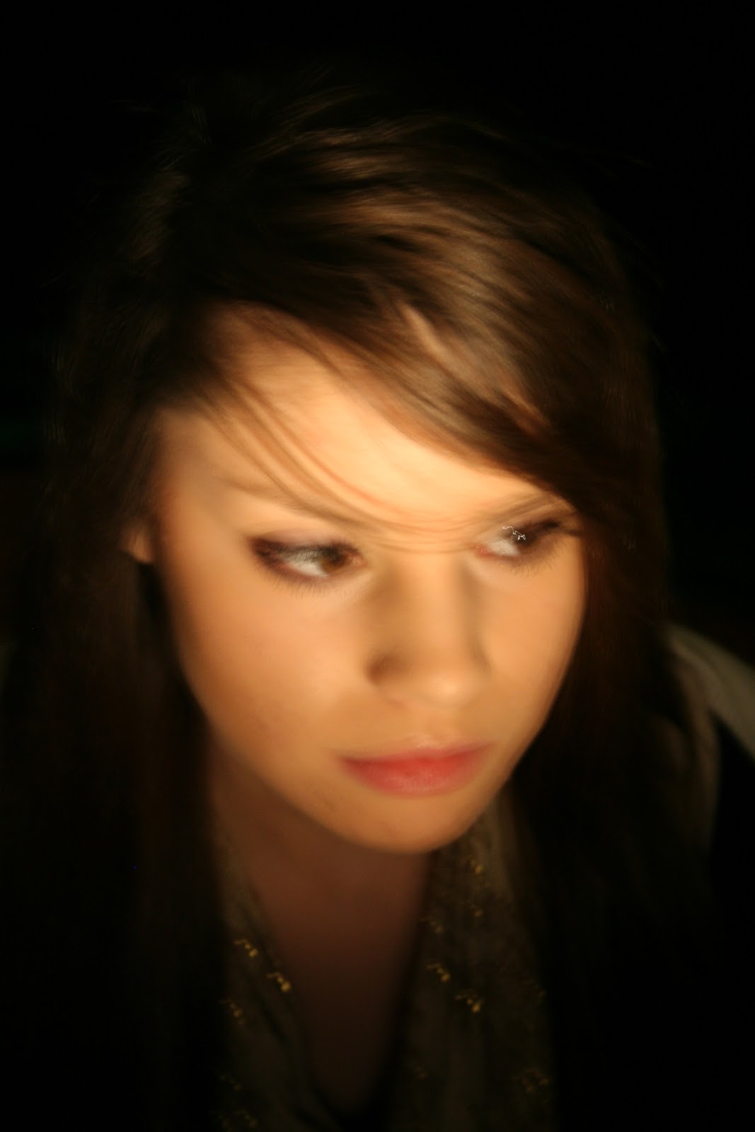
This reminds me of a film noir shot as she is looking down and the camera is then looking down on her. You can see her eyes, cheekbone and the background is black. I also like that the light shining off of her necklaces is visible - possibly showing her wealth and sophistication. Probably the best shot so far.

I love a profile shot, and she has a lovely profile so I'm sure that when i film my OTS, i could replicate this photo in a screen shot.The lighting is very soft and light, but unfortunately it is coming from underneath her chin, making her nostrils attention-seek with the light shining on them!

In this photo i was trying to capture her hair, but still create a black background.I do quite like this angle as her eyes are dark and her profile is lovely. I love the small amount of light shining on her face - very subtle and delicate.
 I wanted to have half of her face in the dark and half of it in the light which could represent the two sides of a character. Even though i accomplished this, the light side is maybe too light. I like that she is looking to the light sight - possible representing something!
  Not the lost brilliant photograph. The light should never be pointed at her crown in the case of a film noir and you cannot see her face as much as you should. Your attention goes straight to her head!
Just like the previous one, her face isn't in the light - which should be! You cannot see her expression and our attention goes straight to her head. Her eyes and chin are in the dark but her nose is in the light. Not what i was aiming for particularly!
 I love this profile and look-up shot! However, the light has kind of ruined this as it is strong on her head but, i like the shine of light on her cheekbone!
AGAIN, the light is shined straight at her head, but as the shine is nearly out of the shot, it doesn't matter as much. Its a shame that there is no diversity of shadow-shades on her face - the light is flat. I like the position of the camera looking down on her.
 In stead of a dark background, this is a light background which i kind of like - however I'm not sure what it will be like when the screen is in black and white. Her face is is full light (shame) but i like the small amount of light on her nose.
I really like the angle of the camera in this one, she looks very sweet and mysterious - we wonder what she is looking at. I tried to capture her eyelashes against the light background because i think that could show femininity. I'm not impressed by the straight light on her chin, it looks a bit strange! I like that she is in the bottom right half of the frame but i would have liked it EVENMORE if the background was black.

If only the background was black! But this photo has captured her eyelashes and i like the half in the light, half not in the light thing. If this photo was taken from slightly higher, i think it would have created more of an effect.


This picture is a bit too close-up and i think that the shadow could been a little darker. Too much of the background is in the light so we are distracted.

If this was taken a little bit lower it would be better, because at the minute, she looks as if she would be very short! Her eye that is in the shadow is undefined.
 I like this photo because: there is a black background, her cheekbone is defined, it is a slight profile shot, and her jawbone has a shadow also. To improve this picture, her fringe could have been on the other side - creating mystery and to give the sense that she has a secret.
 The classic torch-under-the-face-Halloween-shot! I was trying to experiment with different shadows i could create but the light is strong under her shin and has made under her eyes look more enhanced and bigger than what they actually were.
Not the most flattering shadows and the light is wayy to strong on her neck as you. Her nose also has a strange shadow in it - making us focus straight away on that.

When taking these photos, i tried to play with interesting and different angles which could be possible when filming with a film camera. I have to take into consideration whenever looking at these photos that i am filming completely in black and white which could affect the tone of shadows and light. However the similarity with black and white shots and colours shots is that - the brighter the light, the brighter it will turn out on camera and the darker the shadow, the darker the shadow on the camera. I'm glad i had a little practise with the way light can effect mood and impressions of people which I'm sure will come in useful. I need the audience to guess right about a character because there is not a lot of dialogue. The audience needs to guess what a character is like and have their own opinions on them without the characters actually speaking.
No comments:
Post a Comment